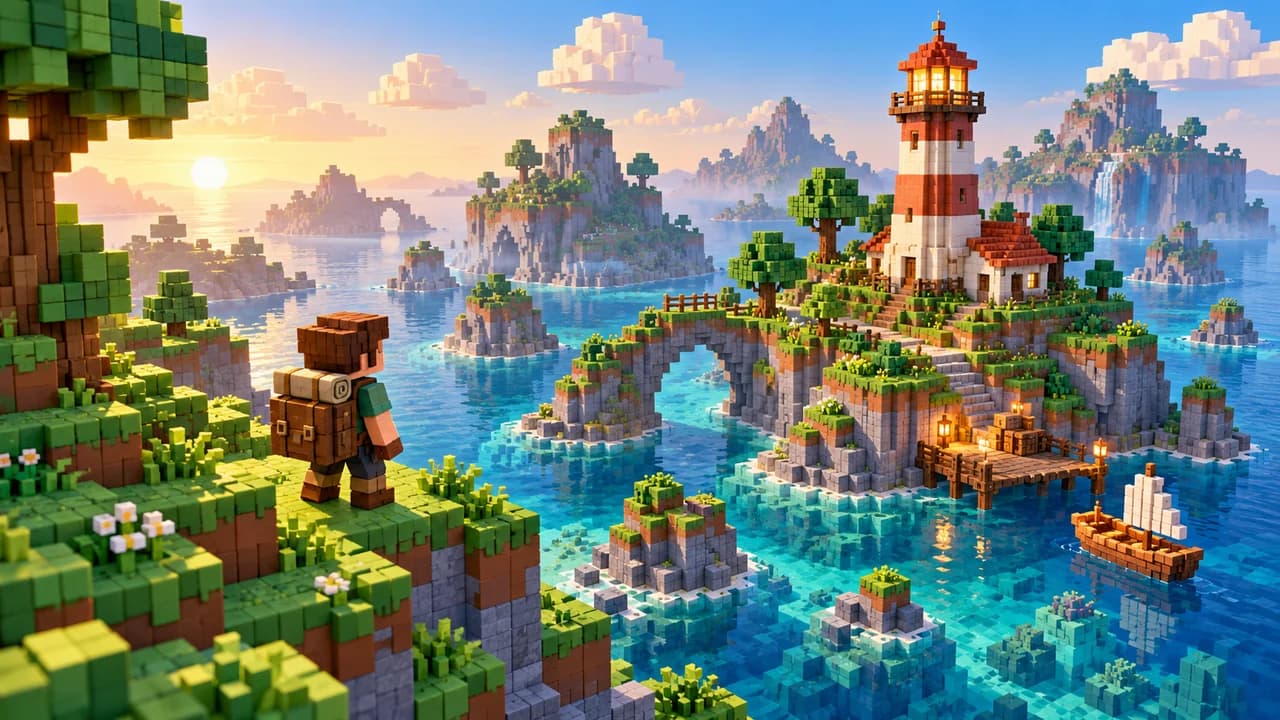
Small volumetric cubes build forms with stepped outlines. Consistent scale and readable large shapes matter more than dividing every surface into extra blocks.
See the traits
A coherent cube scale connects near objects, distant objects and characters
Large color groups separate walkable tops, sides and hazards before details
Light may be soft while outlines retain their cubic steps
Check occlusion from the chosen camera so foreground blocks do not hide a landing
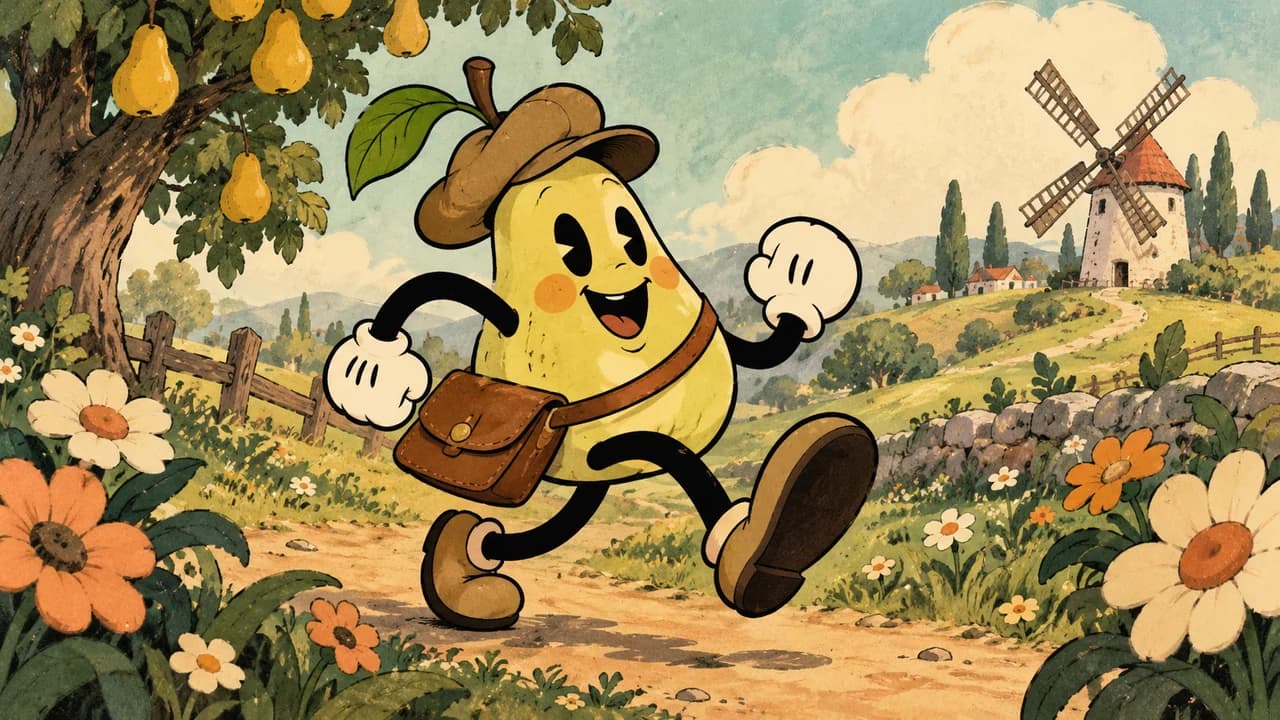
Soft curved limbs and exaggerated poses let a character bend like a rubber hose. Motion rhythm and silhouette define the style; black and white is only one palette choice.
See the traits
Joints may disappear while movement direction and contact points stay clear
Anticipation leads into an exaggerated action and a readable settling pose
A rich painted backdrop leaves key character poses as simple large shapes
Film grain stays subtle and never flickers over text, hit areas or warnings
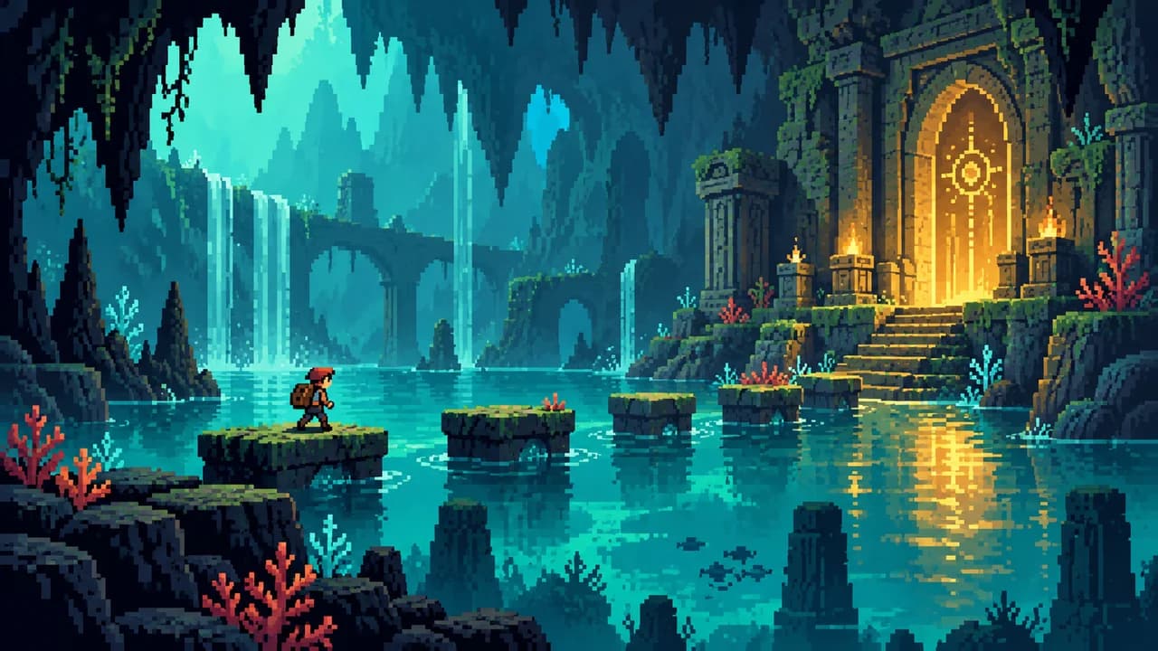
Aligned color blocks and a small palette explain the character, the ground, and the danger. Clarity comes from silhouettes and a few keyframes, not from tiny brushwork.
See the traits
The outline is readable before the details, even on a small screen
Shadows are usually a deeper step of the same hue
A few keyframes, flashes, and landing dust matter more than gradients
A pixel grid makes footing and collisions look honest
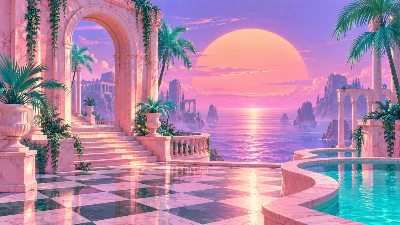
Dusk pink, electronic cyan, and a perspective grid share the frame. The nostalgia comes from outdated statues and interface shapes, not from a distress filter.
See the traits
Pink, cyan, and purple lead; yellow is only a small sign
One grid, one column, or one palm is enough
Gradients are large and shapes are few; any lettering is part of the picture
Glitches and scan lines stay sparse so hotspots remain readable
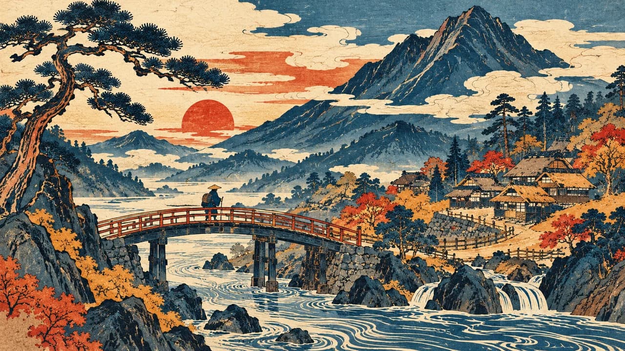
Flat color areas and clean printed edges make the space feel like a sheet that has been laid open. Front and back come from overlap, not from strong perspective.
See the traits
Few inks, with a clean edge on every shape
Waves, clouds, and wind may repeat, while the character stays quiet
Space can be scattered; order comes from which shape covers another
Seals and frames easily compete with buttons, so use them rarely
Reference gamesGetsuFumaDen: Undying Moon · Okami HD
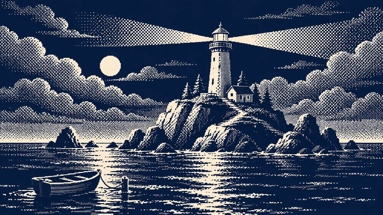
When there are too few colors for a gradient, a fixed dot pattern mixes two of them into a middle tone. The texture comes from the limit, and shadow has a pattern.
See the traits
Two to four colors are typical, and the dot pattern stays fixed instead of crawling every frame
Important contours stay solid; dither handles only the midtones
The direction of the dots can suggest rain, shadow, or material
Text avoids dense dither or it turns fuzzy
Reference gamesReturn of the Obra Dinn · WORLD OF HORROR
Covers are original AI-generated style illustrations. Game names reference publicly visible design choices and remain the property of their owners. This atlas does not supply screenshots or assets from those games. Prompts and combinations are original drafts for new games.